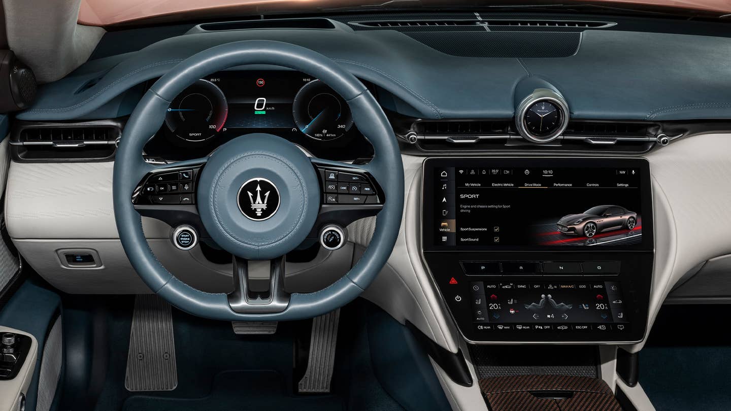
Touchscreens are imperfect, but still the best way to consolidate the multitude of functions in modern cars, Klaus Busse says.

Mentioning touchscreens to most hardcore car enthusiasts is a lot like bringing up SUVs. They pretty much hate them. Sure, they serve a purpose, consolidating many functions of today’s complex vehicles. But in the process, automakers run the risk of overwhelming the driver and ruining the user experience. That’s before you even consider the ergonomics and aesthetics of huge displays, forcing designers to mold entire dashboards around their positioning. Maserati’s global head of design, Klaus Busse is acutely aware of the risks, challenges, and rewards of incorporating touchscreens into Italy’s most legendary grand tourers.
The Drive caught up with Busse at the recent unveiling of the Maserati GranCabrio Folgore in Italy, where the superstar designer shared his feelings about the modern emphasis on touchscreens.
Jerry Perez
“We use screens because there are so many features in a car that if I were to put a button for everything, the cabin would look like an old 747,” Busse told The Drive. “The idea is to organize things in a screen that only presents to the driver what they need at that moment.”
Famous for leading Chrysler, Jeep, Dodge, and Ram’s design renaissance a decade ago, the fashionable German has had his hands full in recent years with brands like Alfa Romeo, Fiat, and of course, Maserati, working his magic with the new Tonale, 500e, and MC20. Busse will admit to not being a “big fan” of touchscreens, but he firmly believes they are the right answer in today’s vehicles, especially luxury sports cars like Maserati.
Busse believes the right formula for a harmonious existence involves design and catering to the driver’s instincts. He explained that screen placement and the information displayed on them must reinforce that Maseratis are about driving enjoyment, and minimize distractions.
“But where do we put the screen? Maserati puts it in a position that if you have your hands on the steering wheel, you can let your hand fall on the screen,” Busse added. “I don’t want the driver to move their shoulder out of the seat to reach for the screen and lose the perfect driving position.
“It’s not up here [atop the dash] where it is in most other cars because I don’t want the screen to visually distract the driver. As a species, we react to movement. The last thing I want [as a designer] is movement in your peripheral view to distract you from what you’re supposed to enjoy, which is the Maserati driving experience. From a distraction point of view and ease point of view, that’s why we move screens down low.”
Maserati
If Busse was given the freedom to design his ultimate interior, would it still include a screen?
“Yes, you know, when I say I’m not a big fan [of screens] it doesn’t mean I would do something different with the interiors. I think [the screen] is the right answer,” he said. “Doing something else means taking away features from the customer.
“A Maserati is not just a sports car, not just a comfortable long-distance cruiser—it’s both worlds, so I need to be able to address all the features that play into these two experiences. There’s only one way to do it, and that’s screens. This is why I wear my smartwatch and not just my analog watch,” said Busse.
Got a tip? Email us at tips@thedrive.com


