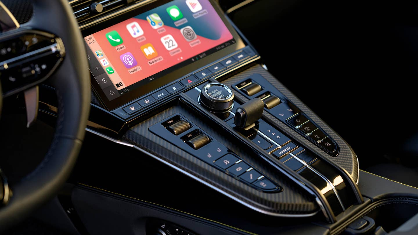
Hate digging through menus to switch on a heated seat? That’s what Aston calls the “piss-off factor.”

Aston Martin wants its interiors to be as simple and easy to use as possible to avoid frustrating its demanding clients. The metric by which it judges its interior controls is called the “piss-off factor,” and it’s almost self-explanatory. If a button, switch, or touchscreen control pisses designers off, it gets ditched.
So many modern cabins have features baked into touchscreen infotainment systems, which can often lead to simple controls like seat heating being buried under multiple submenus. While Tesla certainly isn’t the only touchscreen-heavy brand these days, it is the one that began the trend of routing most controls through the touchscreen, and Aston doesn’t want any part of that.
“The big thing for us is to understand how we layer technology into [a cabin], and we were looking at the likes of Tesla who have been pioneers,” Miles Nurnberger, Aston Martin’s design director, told CarExpert. “We looked at them and very openly, when we first looked at it, said ‘that’s not us.'”
Aston Martin Vantage. Aston Martin
To decide how to best implement their cars’ touchscreens, Aston designers went out and sampled a range of vehicles, using their controls and noting the steps necessary to activate certain functions. Any feature expected to be immediately available that wasn’t triggered the “piss-off factor.”
The new Vantage is a good example of Aston’s design philosophy. It has a touchscreen, but it’s accompanied by many physical buttons, switches, and knobs. Nurnberger told CarExpert that Aston considered moving the seat controls into the touchscreen, but owners said they like to adjust their seat on the move depending on how they’re driving, and touchscreen-based settings are cumbersome and unsafe to use on the fly. The same thinking applies to volume and HVAC-related inputs.
“That’s the thing about the piss-off factor. When you want it, you want it instantly,” said Nurnberger. “If you want to turn the volume up and down, temperature absolutely—the minute you’ve got to go into a screen and tap for temperature, you’ve lost the customer. You’ve lost the experience.”
Aston is echoing what so many of us have already been saying. I think we can all agree that more button-heavy interiors are preferred. Touchscreens require more mental effort to use while simultaneously offering zero tactile feedback—frustrating at best and downright dangerous at worst. The automaker’s approach is a simple and sensible one that the entire industry should follow, especially brands that sell cars most of us can actually afford: if it pisses people off, don’t do it.
Got tips? Send ’em to tips@thedrive.com


