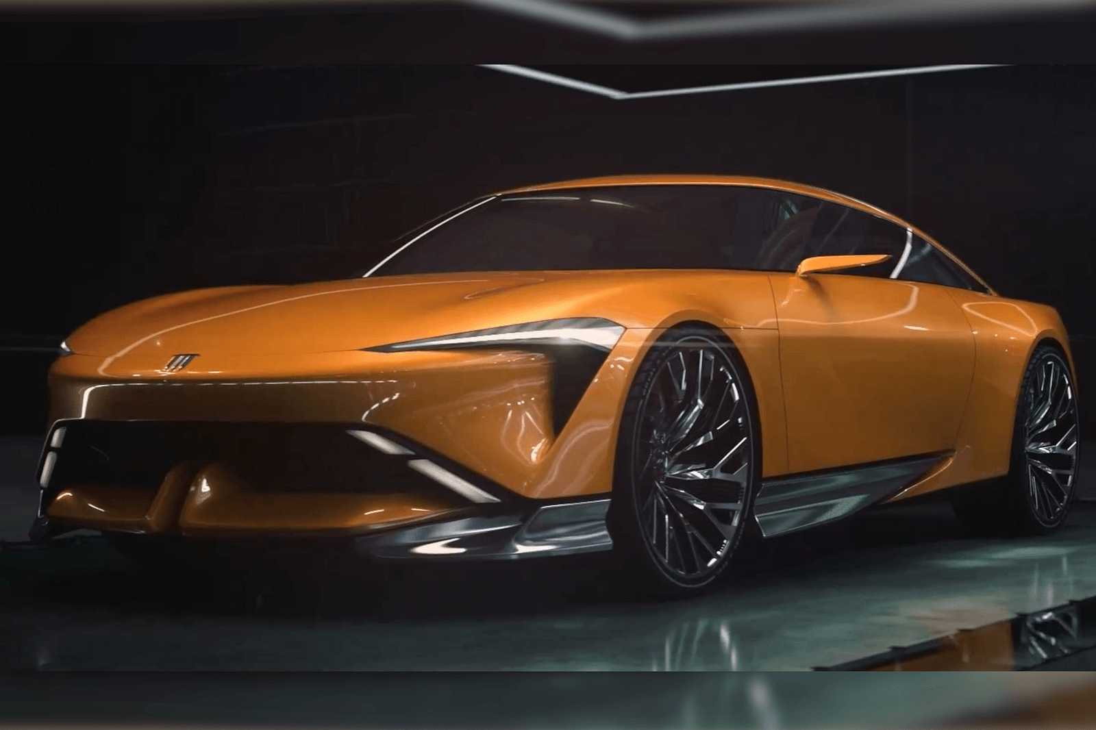
We’ll start with the digital car’s orange hue, which makes a big difference. Buick went for a rather dull gray when it unveiled the Wildcat, and we weren’t blown away. It looks much better in the flesh, as we later found out. Still, orange would have been better.
The design study’s front end is also more reserved compared to the concept. For a company that wants to move away from its past, Buick sure went all-in on the old-school chrome on the front and the turbine wheels.
The most significant changes were made to the rear of the car, where taillights were originally incorporated into what appears to be a flat horizontal element, likely meant to double as a spoiler. These lights were subtle, with another slim LED brake light incorporated at the top of the rear window.
For the concept, Buick went more aggressive, making the taillights wider. They were also extended, running up the sides of the rear windshield.

